“Design is not just what it looks like and feels like. Design is how it works.” – Steve Jobs
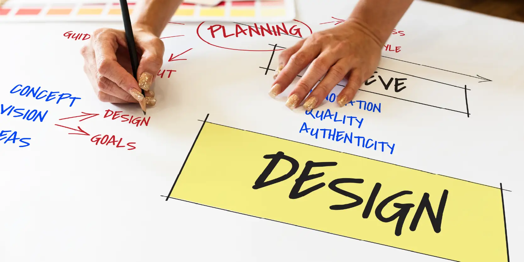
The principles of design are guidelines that are used to create visually appealing, balanced, and effective compositions. These principles ensure that a design communicates clearly and resonates with its audience.
At the heart of design is purpose. Unlike art, design isn’t just about creativity—it’s about functionality. Every element and principle in a design should have a reason for being there. Key principles like emphasis, balance and alignment, contrast, repetition, proportion, movement, and white space work together to create harmony and focus. These principles help guide the viewer’s attention, ensuring the message is delivered effectively.
While there’s debate about how many visual design principles and elements exist, most experts agree there are roughly a dozen fundamental ones. These include primary principles like balance and secondary ones such as typography, color, and framing. Together, they help shape the viewer’s experience by organizing visual elements of a design in a way that feels intentional.
Following these principles ensures that a design strikes a balance between creativity and structure. When done well, a design becomes more than just visually appealing—it becomes relatable and effective in achieving its goals. Whether you’re a beginner or a seasoned designer, adhering to these principles will elevate your work and ensure it leaves a lasting impression.
Key Takeaways
- Elements and principles of design are vital for creating visually appealing and effective compositions, ensuring clarity and balance.
- Key principles include emphasis, balance, contrast, repetition, proportion, movement, and white or blank space, all of which work together to guide the viewer’s attention.
- Emphasis directs focus to important elements, while balance ensures harmony and stability in the design.
- White space adds organization and clarity, enhancing the design’s impact and making it more effective in conveying its message.
Understanding the 7 Principles of Design Fundamentals
Principle of Design: Emphasis
Emphasis is a core principle that focuses on creating a focal point to guide the viewer’s attention. It ensures that the most important elements of a composition stand out, making the message clear and engaging. This principle is achieved by using contrast, color, size, or placement to highlight key elements.
For example, if you’re designing a concert poster, the band’s name might be the most critical piece of information. To emphasize it, you could use bold typography, vibrant colors, or a prominent central placement. Emphasis is not just about making elements noticeable—it’s about creating a hierarchy of importance. A well-designed layout directs the viewer’s eye naturally, from the most critical information to secondary details.
Conversely, emphasis can also be leveraged to downplay less important elements. Fine print, for instance, is often placed at the bottom of a design in small, subtle fonts, ensuring it doesn’t compete with primary information.
However, using emphasis within a design effectively requires balance. Overloading a design with too many emphasized elements can confuse the viewer, while too little emphasis can make the composition dull or unclear. By carefully selecting which elements to highlight and which to downplay, designers can create a visually appealing and communicative design that captures attention and conveys the intended message.
Principle of Design: Balance
Balance is an important principle that focuses on the distribution of visual weight across imagery. Every design element—whether it’s color, size, texture, or shape—carries a weight that affects how the overall design feels. Without balance, a design can feel lopsided or unsettling, making it hard for the viewer to engage with the content.
There are two primary forms of balance: symmetrical and asymmetrical. Symmetrical balance involves placing elements of equal weight on either side of an imaginary center line. This creates a sense of harmony and stability. It’s similar to a perfectly organized room where everything is evenly distributed. While symmetrical designs are always visually pleasing, they can sometimes lack excitement.
Asymmetrical balance, on the other hand, uses elements of different weights to create equilibrium. For example, a large object on one side of the page might be balanced by several smaller objects on the opposite side. This approach adds movement and aesthetic interest, making the design feel dynamic.
By carefully arranging elements to achieve balance, designers create a sense of harmony and stability. This ensures the audience’s eye moves naturally across the page, keeping them engaged without feeling overwhelmed or distracted. Ultimately, balance makes designs more effective and visually appealing.
Principle of Design: Contrast
“Accessible design is good design.” – Steve Ballmer
Contrast is the key to making a design stand out and grab attention. It refers to the differences between elements, such as colors, shapes, sizes, or textures, that create visual interest and clarity. A design with strong contrast “pops” off the page, making it memorable and effective.
One of the simplest ways to achieve contrast is by pairing light and dark colors. For example, a dark background makes light-colored text easy to read. This is especially important for accessibility, as insufficient contrast can make text difficult for people with visual impairments to see.
Contrast is also crucial when working with type. Using different font sizes or weights can guide the audience’s attention to what matters most. For instance, avoid making everything bold—reserve that for key points. Sticking to one or two strong typefaces, or variations of the same typeface, can help maintain balance while still creating contrast. Adding too many typefaces can overwhelm and confuse your design.
Incorporating contrast through shapes and sizes can also break up monotony. A mix of large and small elements or varying textures adds depth and dynamism. Whether designing a webpage, poster, or space, using contrast effectively ensures your design is not only visually appealing but also functional and accessible.
Principle of Design: Repetition
“Great things are not done by impulse, but a series of small things brought together.” – Vincent Van Gogh
Repetition is a key principle that helps unify and strengthen visuals. It involves using the same elements—like colors, typefaces, shapes, or patterns—consistently across a design. This approach not only ties various elements together but also reinforces ideas, creating a sense of rhythm and harmony.
Imagine a band poster where one element is styled in blue italic sans-serif. It might look like a mistake. But repeat that same style across three different parts of the design, and you’ve created a pattern that feels intentional. Repetition brings control and balance, turning individual elements into a unified whole.
Repetition is essential for brand identity as well. A logo, used consistently on websites, business cards, and social media, builds familiarity and trust. This consistency across platforms gives a startup or business a professional and polished image.
Design projects that incorporate repetition also cater to how our brains naturally seek patterns. For instance, repeating flowing patterns can evoke motion, like the gentle movement of water or wind. This adds energy and aesthetic interest to the design, making it more engaging.
Whether it’s consistent headings in a document or repeating motifs in a visual layout, repetition is a versatile tool that brings rhythm, harmony, and clarity to any design. Done thoughtfully, it transforms scattered elements into a cohesive and memorable experience.
Proportion in Principles of Design
Proportion is a key design principle that focuses on the visual size, weight, and relationships between elements in a composition. Simply put, it’s about how different parts of your design work together in terms of size and other attributes like color, shape, and texture. Proportion helps guide the viewer’s attention, signaling what’s important and what isn’t. Larger elements naturally draw more attention, while smaller ones play a supporting role.
To achieve good proportion, it’s helpful to think of your design in sections rather than as a whole. For example, grouping related items, like a box for ticket information on a poster or a sidebar on a website, can make smaller elements stand out without overwhelming the design. This thoughtful placement ensures harmony and balance, making the composition feel cohesive and unified.
When elements are in proportion, the design feels stable and visually pleasing. Conversely, poor proportion can lead to discord and make the design look unbalanced. Achieving proportion requires mastering other design principles like alignment, balance, and contrast. Once these are in place, proportion often comes naturally, creating a design that feels both intentional and effective.
Proportion is about ensuring every element in your design serves a goal and contributes to a visually harmonious composition.
Movement in Principles of Design
Movement guides how the viewer’s eye travels through a composition. It ensures that information is communicated effectively by navigating the eye from one element of design to the next in a logical and engaging sequence. Movement creates a narrative for your design, helping viewers understand the message and its importance.
Designers use several techniques to achieve movement. Positioning is one of the most effective methods, as the eye naturally gravitates to certain areas first. For example, a headline at the top of a page or a brightly colored element in a neutral background draws attention. Emphasis and hierarchy also play vital roles, directing the viewer’s focus from the most important elements to supporting details.
Repetition and contrast are essential tools for creating movement. Repeating shapes, colors, or patterns establishes a rhythm that keeps the viewer’s eye moving. Contrast, such as light against dark or bold against subtle, adds aesthetic interest and directs focus.
It’s important to review your design carefully. If any element feels too overpowering, awkward, or disconnected, it can disrupt the flow. Adjust until every part works in harmony, guiding the viewer seamlessly through the piece. By mastering movement, designers can control how their audience experiences and interprets their work.
Principle of Design: White Space
White space, also called negative space, is the empty area surrounding the elements in a design. While it may seem like “blank” space, it serves a crucial purpose in creating effective, visually appealing compositions. Unlike other design principles that focus on what you add, negative or blank space is all about what you leave out.
Giving your design room to breathe can make all the difference between cluttered and clean. White or blank space adds organization and hierarchy, guiding the viewer’s eye to the most salient elements. It naturally groups related items while separating unrelated ones, helping your audience process information more easily.
This principle is especially effective in emphasizing key content. For instance, designs with ample negative or blank space around typography can improve readability and highlight essential text. Negative space can also create aesthetic interest, balance, and even motion, making your design more dynamic and engaging.
Far from being wasted space, white or blank space can elevate your design by conveying luxury, simplicity, and clarity. Sometimes, it even serves as a hidden design element. For example, logos often use negative or blank space creatively to reveal additional shapes or messages.
Embracing white or blank space isn’t about doing less—it’s about designing smarter. A thoughtful use of negative or blank space can transform your work from good to outstanding, so don’t be afraid to leave some areas untouched.
Wrap-up: Principles of Graphic Design
The basic principles of design serve as a roadmap for creating compositions that are visually engaging and functionally effective. At their core, these principles emphasize clarity, purpose, and balance, ensuring every element contributes meaningfully to the overall message. From creating focus through emphasis to establishing harmony with balance and proportion, each principle plays a role in guiding the viewer’s attention and enhancing the design’s impact.
Contrast and repetition add visual interest and cohesion, while movement ensures the audience’s eye flows naturally across the layout. Equally important is white or blank space, which provides breathing room, sharpens focus, and adds elegance. Together, these principles transform scattered elements into unified designs that leave a lasting impression.
Whether you’re designing a poster, a webpage, or a brand identity, understanding and applying these principles will elevate your work. With practice and thoughtful execution, you can craft visual designs that are not only beautiful but also purposeful and impactful.
Design Principles: FAQs
1. What are the principles of design?
The principles are directives that help create visually appealing and effective compositions. They include emphasis, balance, contrast, repetition, proportion, movement, and white or blank space. These principles ensure harmony and clarity in design by organizing elements purposefully and guiding the viewer’s attention.
2. Which design principle is related primarily to size?
Proportion focuses on size and the relationship between design elements. Larger elements naturally draw attention, while smaller ones support the overall composition, creating a sense of balance and focus.
3. How does contrast improve a design?
Contrast highlights differences between elements, such as colors, shapes, or sizes, to create aesthetic interest. It makes key elements stand out, ensuring the design is clear, engaging, and accessible.
4. Why is white space important?
White space, or negative space, prevents clutter and adds clarity. It highlights essential content, organizes information, and creates an elegant design that is easy to follow.
Create Winning Presentations with Prezentium’s Design Expertise
At Prezentium, we understand that effective presentations go beyond the content—they rely on smart design to make an impact. By using the design principles, we ensure that your presentation is not only visually appealing but also communicates your message clearly and effectively. We emphasize purpose, balance, and harmony in every slide, making sure that each element has a reason to be there. From creating focal points through contrast and emphasis to ensuring a smooth flow with movement and white or blank space, our team combines design and data-science to engage your audience.
Whether you need an overnight presentation, a custom template, or expert design advice, Prezentium’s services, including Accelerators and Zenith Learning, are designed to help you craft slideshows that leave a lasting impression. Reach out to us today, and let us show you how thoughtful design can transform your ideas into winning presentations.