
Choosing the best font for your PowerPoint presentation can make a big impact. Good fonts for presentations are more than just text—they help set the tone and reinforce your message. Cool presentation fonts can engage your audience, while poor ones can distract or confuse them.
The key is to find one font that matches your PowerPoint presentation design and style. Serif fonts, such as Times New Roman, are often perceived as traditional and reliable, making them ideal for formal settings. Sans serif fonts, such as Helvetica, are modern and clean, perfect for more casual or creative presentations. Professional fonts for presentations should enhance your slides, not overshadow them.
Remember, your choice of font style matters as much as your visuals. It helps convey the right mood and personality, so select one that connects with your communication.
Cool Fonts PowerPoint: Key Takeaways
- Choose the Right Font: The font family you select for your PowerPoint presentation impacts how your message is received. Fonts such as Times New Roman are best for formal settings, while Helvetica and Arial work well for casual or creative presentations.
- Readability is Key: Fonts such as Tahoma and Verdana are designed for clear on-screen readability, making them ideal for various devices and screen sizes. Roboto and Lato also offer modern, easy-to-read options.
- Consider Your Audience: Fonts such as Helvetica and Montserrat provide a clean, professional look, suitable for titles and headings. For a sophisticated touch, Garamond and Bentham fonts are excellent choices.
- Enhance Your Message: Your choice of PPT best font should support your PowerPoint presentation’s purpose and style, enhancing clarity and engagement without overshadowing your content.
15 Best Fonts for Presentations: Nice Fonts for PowerPoint Presentations
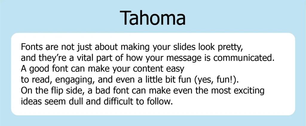
Tahoma
Tahoma is a sans-serif font designed specifically for on-screen use, offering excellent clarity and readability. Introduced in 1995 by British typographer Matthew Carter for Microsoft, it became a popular choice for PowerPoint presentations. While similar to Verdana, Tahoma has a narrower body and tighter letter spacing, giving it a more formal appearance.
One of Tahoma’s standout features is its easily distinguishable characters, which is particularly helpful for technical and scientific presentations. The font ensures that characters like the uppercase “I” and lowercase “l” are clearly differentiated, reducing the risk of confusion. Its modern look and screen-friendly design make it ideal for presentations on various devices and screen sizes. If you want a sleek, professional, and easy-to-read font, Tahoma is a reliable choice.
Verdana
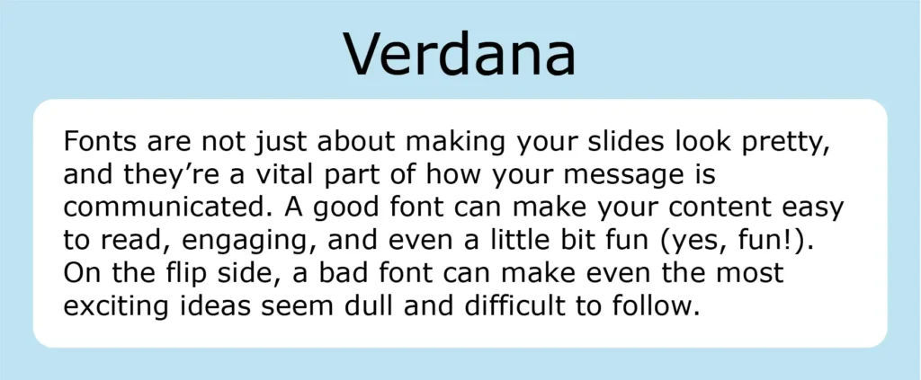
Verdana is a popular font choice for PowerPoint presentations due to its clear and bold design. Created by Matthew Carter for Microsoft in 1996, it was specifically designed for readability on screens. Its tall lowercase letters and wide spacing make it highly legible, even in smaller font sizes. This makes Verdana the perfect font for body text, footnotes, references, and disclaimers.
One of the best features of Verdana is its compatibility across both Mac and Windows systems, making it a safe choice when you are unsure of where your presentation will be viewed. Whether you’re presenting on a small screen or projecting to a large audience, Verdana ensures your text will be easy to read from any distance. Its wide availability also means that your slides will likely appear as intended on nearly any device.
Helvetica
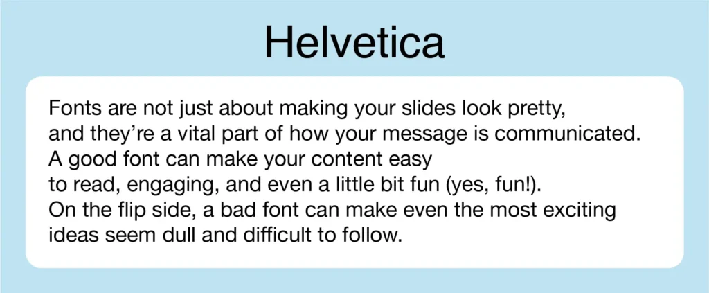
Helvetica is a classic sans-serif font that’s widely loved for its clean, neutral, and modern look. First introduced in 1957, it was designed to create balanced letterforms, making the top half of each letter slightly larger than other sans-serif fonts. This unique feature gives Helvetica excellent readability, especially from a distance, which makes it ideal for live presentations or large groups.
When used in bold or all caps, Helvetica shines as a great choice for headings and titles. Its clean, professional design also makes it a popular option for branding and marketing presentations. With several variants available, like Helvetica Inserat or Neue Helvetica, there’s plenty of flexibility if you want a slight twist on the classic.
Whether you’re making posters or delivering a live presentation, Helvetica ensures that your key points are clear, even to those sitting at the back. Its versatility and timeless appeal make it a solid go-to font for any professional slide deck.
Roboto
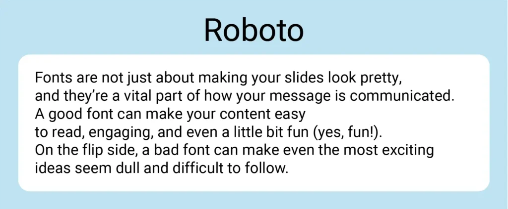
Roboto is a modern sans-serif font developed by Google that’s perfect for a wide range of presentations. Its clean and elegant design makes it highly readable, especially for body text. Whether you’re presenting in a tech-focused field or any other industry, Roboto brings a professional and polished feel to your slides.
This versatile font pairs effortlessly with others like Garamond (serif), Gill Sans (sans serif), or Pacifico (script font), giving your presentation a cohesive and well-designed look. Roboto’s modern and approachable appearance, combined with its readability, makes it an excellent choice for any presentation that demands clarity and font.
Lato
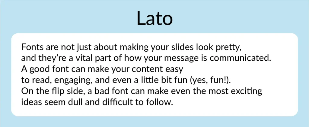
Lato is a modern sans-serif font that offers both style and readability. It’s a popular choice for presentations because of its clean, contemporary look. One of Lato’s strengths is its versatility, with nine different weights ranging from hairline to black. This gives you many custom font options to match the tone of your presentation, whether you need a light touch for body text or a bold weight for headers.
Lato’s approachable style makes it easy to read, even at smaller sizes. It’s perfect for both headers and body text, ensuring a professional yet friendly feel. Whether you’re creating a pitch deck or a general presentation, Lato is a safe and reliable choice that conveys professionalism without feeling too rigid.
Bentham
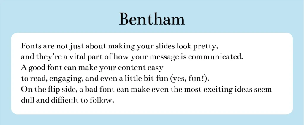
Bentham is a stunning font known for its traditional yet elegant style, making it a perfect choice for headers or subtitles in business presentations. Its well-defined letterforms and balanced serifs give your slides a refined, sophisticated look. Bentham works well in uppercase, lowercase, or title case, depending on the overall design of your presentation.
This font is free and versatile, allowing you to add letter spacing for a unique effect on your slides. For the best results, pair Bentham with a sans serif font, such as Futura or Open Sans for your body text, creating a balanced and polished presentation.
Fira Sans
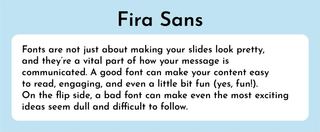
Fira Sans is a versatile and modern font that works well in many types of presentations. Its clean design makes it perfect for both headers and body text, allowing you to keep a consistent look throughout your slides. You can use different weights like normal and bold for emphasis, or mix in other styles like italic or underline for variety. Fira Sans pairs well with a serif font as an accent, adding contrast to the design. With its flexibility and stylish appearance, Fira Sans is a great choice for any presentation.
Archivo Black
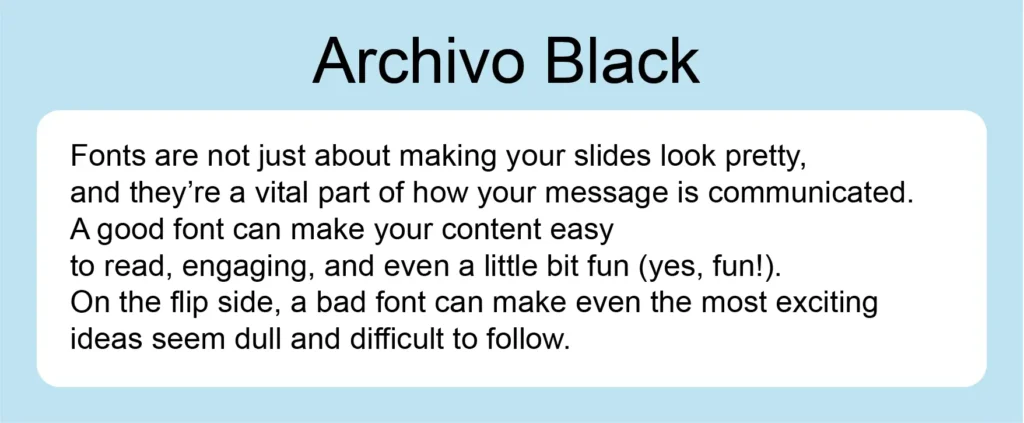
Archivo Black is a bold and striking font that makes a strong impression. Its heavy, uppercase letters give it a powerful presence, making it ideal for titles and headlines. Whether used in large or smaller sizes, Archivo Black stands out on your slides, adding a strong visual punch. This font is perfect for grabbing attention and ensuring that your key points are noticed.
Montserrat
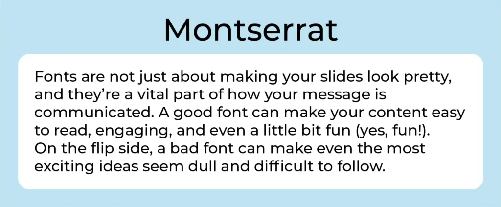
Montserrat is a geometric sans-serif font that stands out for its modern and stylish appearance. It’s an excellent choice for presentation titles and headers, as it makes bold statements and captures the audience’s attention.
This versatile font helps slide titles and headers stand out clearly, ensuring your audience knows exactly what to expect as you move from one slide to the next. Its bold design is both professional and visually appealing, making it a great option for marketing or business plan presentations.
One of Montserrat’s standout features is its adaptability. By adjusting the font weight, you can achieve a variety of looks, giving you flexibility in your presentations. This makes it easy to maintain visual interest while keeping your slides cohesive.
Additionally, Montserrat pairs well with other fonts. For a balanced look, try combining it with a thin sans-serif font in your body text. This contrast enhances readability and adds a polished touch to your slides.
Open Sans

Open Sans is a popular font known for its clean and readable design. It’s a great choice for both body text and headings in your presentation slides. This sans serif font is simple yet effective, making it easy to read and understand, whether you’re presenting in print or on screen.
Its friendly and approachable look makes Open Sans ideal for educational content, webinars, and instructional materials. By using Open Sans, you can ensure that your audience easily absorbs the information you’re sharing. Its versatility allows it to perform well in various parts of your presentation, from large blocks of text to prominent headings. If you want a font that blends clarity with a modern touch, Open Sans is an excellent option.
Libre-Baskerville
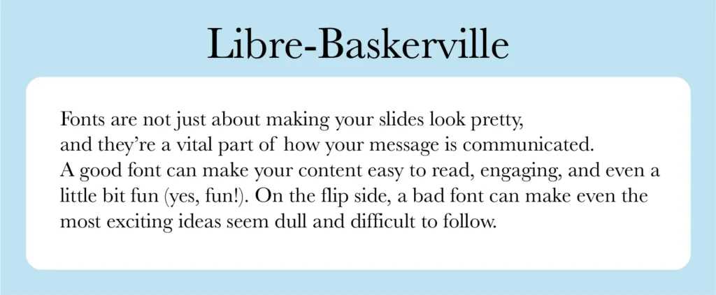
Libre-Baskerville is a free Google font that adds a classic touch to your presentations. It’s a serif font, making it perfect for a traditional look. You can pair it with various other fonts and color schemes, giving your slides a timeless feel.
One of the best things about Libre-Baskerville is its versatility. It works well for headings and also body text. Whether in uppercase for titles or in paragraphs, it’s clear, legible, and easy to read. This font never goes out of style and adds a sleek, polished look to any presentation.
Futura
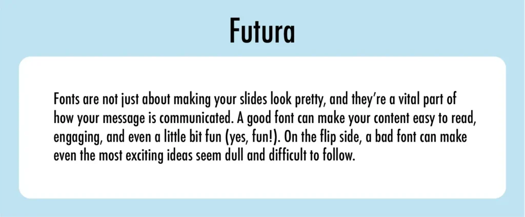
Futura is a popular font known for its clean, geometric shapes, including circles, triangles, and rectangles. Created in 1927, it has remained a default font choice for presentations due to its readability, modern look, and versatility. Futura works well for both headlines and body text, making it adaptable to various design needs. It projects a sense of efficiency and progress, which is why many brands have used it in their logos. Whether you want a sleek, modern feel or just a reliable, elegant typeface presentation, Futura is a solid option.
Garamond
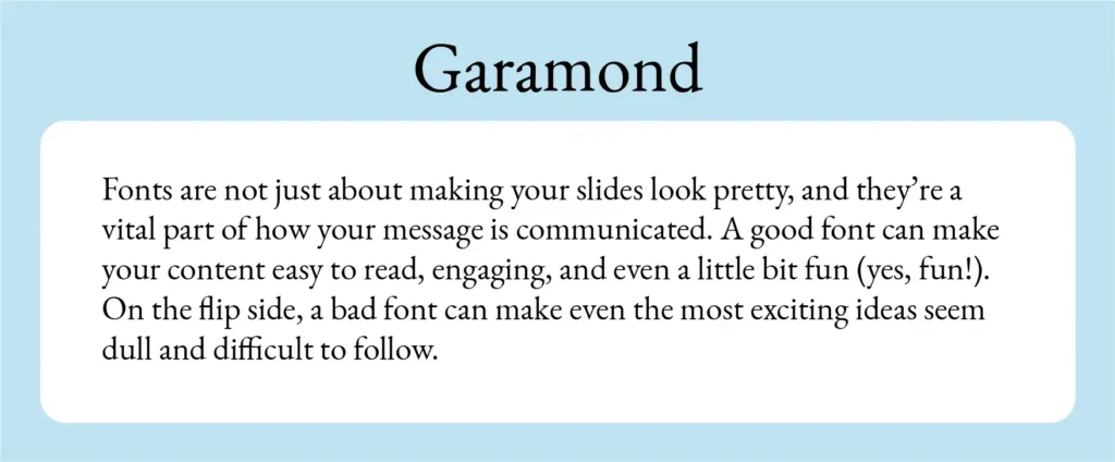
Garamond is a classic font that dates back to the 1500s, originally designed by Claude Garamond. It’s not just a single font but a family of styles, including Adobe Garamond, Monotype Garamond, and Garamond ITC. Known for its timeless elegance, Garamond features refined serifs and well-balanced letters, making it a great choice for presentations that need a professional and sophisticated touch.
Garamond is especially loved for its readability, with its straight ascenders and horizontal crossbars. This design makes it ideal for body text in both print and digital presentations. It’s a popular font for literary, historical, and high-end corporate content, offering both style and clarity. Whether you’re working on a sleek business pitch or a classic design, Garamond brings a sense of tradition and polish to your slides.
Raleway

Raleway is a modern sans-serif font that stands out for its clean and elegant look. Originally designed as a lightweight typeface, it now comes in bold and italicized versions, making it highly versatile for presentations. Whether used for bold headers or lighter body text, Raleway maintains clarity and readability.
Its sleek, minimalistic design gives presentations a contemporary feel, while the subtle artistic touches, like off-centered bowls and swashes, add character without compromising legibility. This makes it a great choice for both titles and body copy, ensuring your slides look professional and polished.
Palatino
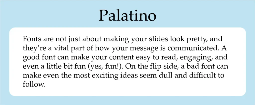
Palatino is a classic font designed by Hermann Zapf in 1949, drawing inspiration from the Italian Renaissance and calligraphy. Known for its smooth lines and wide structure, Palatino offers both elegance and readability, making it a great choice for PowerPoint presentations.
Originally created for use in headlines and advertising, Palatino remains easy to read from a distance or in small sizes. This quality makes it ideal for both headers and body text in your presentations, adding a touch of sophistication while ensuring clarity. Its vintage vibe pairs well with professional slides, giving your content a unique yet polished look.
Wrap-up: Cool Presentation Fonts
Choosing the best fonts for your presentation is vital for effectively communicating your message and engaging your audience. Different fonts play a significant role in setting the tone and making your content clear and memorable. For formal settings, Times New Roman font can convey reliability, while Helvetica and Arial offer a modern, clean look suitable for casual or creative presentations.
Tahoma and Verdana fonts are great for on-screen readability, ensuring your text remains legible across different devices. Roboto and Lato provide a contemporary feel and are versatile enough to use in various presentation styles. For a touch of elegance, consider serif fonts like Bentham or Garamond. Each font choice affects how your message is perceived, so select one that complements your presentation’s purpose and enhances its overall effectiveness.
Frequently Asked Questions (FAQs)
1. What makes a good font for presentations?
A good font enhances readability and matches the presentation’s tone. Fonts like Times New Roman are suitable for formal settings, while sans-serif fonts, such as Helvetica and Arial, offer a modern, clean look.
2. Why is Tahoma a popular choice for presentations?
Tahoma is favored for its clarity and readability on screens. Its narrow body and distinct characters make it ideal for technical and scientific presentations.
3. How does Verdana improve presentation readability?
Verdana features tall lowercase letters and wide spacing, ensuring clear readability even at smaller sizes. It’s compatible with both Mac and Windows, making it reliable for various devices.
4. When should I use fonts like Roboto and Lato?
Roboto and Lato are versatile sans-serif fonts perfect for a contemporary, professional look. Use them for both body text and headings to maintain a polished and cohesive design.
Elevate Your Presentation with the Right Font
At Prezentium, we understand that the ideal font can transform a good presentation into a great one. Whether you need an overnight presentation, a polished design through our Accelerators, or engaging training with Zenith Learning, choosing the perfect fonts for professional presentations can make all the difference.
Fonts like Helvetica and Verdana ensure clarity and modern appeal, while classics like Garamond and Palatino add a touch of sophistication. With our expert team, you can leverage these fonts and more to craft professional presentations that reinforce your message effectively.
Let Prezentium help you make an impactful impression with stylish, readable fonts. Reach out to us today to create presentations that captivate and communicate.