
The impact of colors on slide presentations is profound. Colors don’t just about make slides look pretty; they influence how your audience feels and understands your message. Different colors evoke various emotions and associations. For instance, red can express urgency or danger, while blue can evoke calmness and trust.
Choosing the right colors is crucial. For instance, a pitch to new clients might need exciting colors to energize them, while a presentation to long-standing investors might require stable and reassuring hues.
Professionalism is key. Amateurish presentations can tarnish your image. Your slides should match your professionalism, making color selection vital.
But it’s not just about aesthetics; it’s about conveying information effectively. High contrast between background and text aids readability, while low contrast can hinder comprehension. Striking the right balance ensures your audience grasps your message effortlessly.
Color choice impacts perception. It aids retention and enhances visual appeal, making your presentation memorable. Whether you’re restricted by brand colors or have the freedom to choose, picking the right palette is essential for success. So, ensure your color scheme reflects your message and captivates your audience, setting the tone for your presentation’s success.
Key Takeaways
- Branding: Incorporate your company’s color palette to maintain brand identity and convey a consistent message.
- Readability and Contrast: Prioritize high contrast between foreground and background colors for optimal device readability.
- The 60-30-10 Rule: Balance dominant, secondary, and accent colors using this straightforward guideline for harmonized color proportions.
- Color Psychology: Understand how colors evoke emotions and perceptions to convey your message strategically.
- Color Groups: Differentiate between warm and cool colors to avoid mixing across groups and prevent visual discomfort.
- Color Schemes: Choose color combinations that suit your audience and setting, prioritizing readability and consistency.
- The Color Wheel: Utilize this tool to grasp color relationships and categories, guiding your selection process for cohesive presentations.
Seven Things to Remember When Selecting the Best Colors for Your Next Presentation
Branding

Incorporating branding elements into presentations is vital for conveying a consistent message. Start with your company’s color palette, ensuring it complements the logo and brand colors. This cohesion reinforces brand recognition without overpowering the message. For instance, HubSpot subtly integrates its signature orange across presentation slides, maintaining brand identity without overt logos.
Even with predefined templates, understanding color selection remains crucial. You may need to choose colors for visuals to ensure text clarity, enhancing comprehension within brand guidelines.
Colors wield psychological influence, shaping perceptions and emotions, thus becoming integral to branding and marketing strategies.
Consistency reinforces professionalism. Use consistent color schemes, fonts, and layouts throughout presentations to strengthen your message, identity, and credibility. Aligning with brand colors fosters trust and familiarity, which is essential for audience engagement and recognition. Whether using predefined palettes or online tools, maintaining brand-aligned consistency enhances presentation effectiveness.
Readability and Contrast

Creating slides with optimal readability and contrast is crucial for effective communication. When choosing colors, prioritize high contrast between foreground graphics or text and the background to ensure clarity and visibility. This contrast not only enhances readability but also aids individuals with color blindness in distinguishing content.
Using light and dark contrasts within color groups, such as black text on a white background or white text on a navy background, enhances text visibility and readability. Avoid color combinations that strain the eyes or lack sufficient contrast, like neon green text on a dark background.
Incorporating neutral colors, such as gray or white, as background shades can further enhance readability and professionalism. Whether using dark or light backgrounds, ensure text colors contrast sharply for maximum impact.
Before finalizing your presentation, test your color choices for readability, accessibility, and compatibility across different devices and screens. Utilize contrast checker tools to measure contrast ratios and color blindness simulators to assess accessibility. By prioritizing readability and contrast, you can create visually engaging slides that effectively convey your message to all viewers.
The 60-30-10 Rule

The 60-30-10 rule is a straightforward guide for harmonizing colors in your slides. It advises using 60% of a dominant color, 30% secondary color, and 10% of an accent color. The dominant color serves as the backdrop or main hue. The secondary color complements or contrasts with the dominant one. The accent color adds emphasis to crucial elements like headings or graphs.
To apply this rule effectively, consider the rule of thirds. This principle advocates for distributing color proportions to create balance and visual interest. By allocating 60% to the dominant color, 30% to the secondary, and 10% to the accent, you establish hierarchy and contrast without overwhelming your audience. For instance, you might employ a light background (60%), dark text (30%), and vibrant highlights (10%) to achieve this balance.
Color Psychology

Understanding color psychology is essential when creating presentation slides. Colors evoke emotions and perceptions, influencing how your audience interprets your message. Different colors carry distinct meanings and associations, impacting your presentation’s overall mood and reception.
For instance, red signifies passion and urgency, while blue conveys trust and professionalism. Warm colors like red and orange grab attention, making them suitable for highlighting important points, while cool colors like green evoke a sense of trust and stability.
Cultural upbringing, brand exposure, and personal experiences influence individuals’ emotional responses to colors. Therefore, while color meanings provide guidance, they aren’t absolute. It’s crucial to consider your audience’s context when selecting colors for your slides.
Color psychology plays a crucial role in marketing and branding. It aligns colors with brand identity and messaging to evoke desired emotions and perceptions. By strategically using colors that resonate with your message and audience, you can enhance the effectiveness and impact of your presentation.
Color Groups
Colors can be divided into two main groups: warm and cool colors. Warm colors include reds, oranges, and yellows, which tend to stand out and attract attention. On the other hand, cool colors encompass greens, blues, and purples, which recede into the background and draw less attention.
It’s advisable to avoid mixing colors from these groups as they can create unpleasant contrasts. For instance, red text on a blue background or green text against an orange background can strain the eyes and make reading difficult.
Creating a color palette using colors from the same group is beneficial when designing presentation slides. For example, a combination of blue, purple, and gray blends harmoniously without competing for attention.
While warm and cool colors generally have distinct effects, they may vary depending on quantity and contrast. For instance, small black shapes on a white background may appear more noticeable due to the contrast, emphasizing the importance of considering these factors when combining colors on slides.
Neutral colors like white, black, and beige complement warm and cool colors and serve as versatile options for backgrounds or accents. However, caution should be exercised when crossing the warm/cool boundary, as mixing colors across these groups can lead to visual discomfort, especially for individuals with color blindness.
Utilizing PowerPoint themes can simplify color combinations, as theme colors are curated to complement each other and perform well in various presentation environments. By understanding color groups and their effects, presenters can create visually appealing slides that effectively convey their message while avoiding visual distractions and discomfort for the audience.
Color Schemes

A color scheme in presentations is a collection of colors that work well together, creating a pleasing and unified appearance. You can easily find suitable color palettes using online tools, or you can start with your logo or brand colors and build from there.
Professional presentations often use specific color combinations, such as gray and yellow or blue and white. These combos are seen as professional because they balance sophistication with energy and optimism or trustworthiness with clarity and authority, making them perfect for business settings.
Consider your presentation screen when choosing colors. Darker schemes suit close-up screens, while lighter ones are better for projections to ensure readability. Avoid bright colors, especially red text on projectors, as they wash out easily.
When choosing colors, think about your audience and setting. Neutral colors like blue, gray, and white are great for professional presentations, while brighter ones like yellow or green might work better for creative or educational topics. Always prioritize readability and avoid jarring color combinations.
Stick to your chosen color scheme throughout the presentation for consistency. Limit yourself to three or four colors to maintain cohesion and avoid distractions. Ensure enough contrast between text/graphics and the background for clarity.
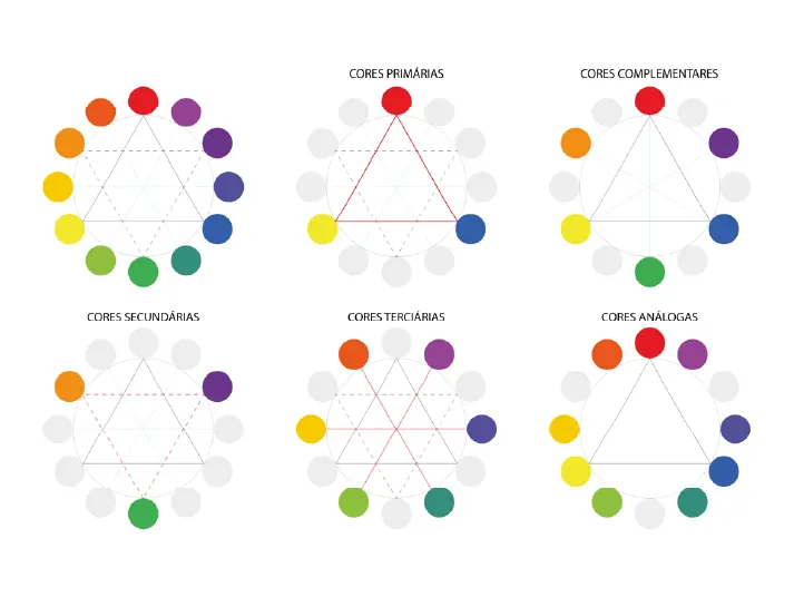
The Color Wheel

The color wheel is a potent tool for understanding color relationships and categories. It features three primary colors (red, yellow, and blue), three secondary colors (orange, green, and purple), and six tertiary colors (like red-orange or yellow-green). This wheel helps in creating diverse color schemes for presentations.
Isaac Newton, at the age of 23, invented the color wheel. He realized how colors, perceived by humans, blend to form captivating combinations. His categorization included:
1. Primary Colors: Red, yellow, blue
2. Secondary Colors: Orange, green, violet (formed by mixing primary colors)
3. Tertiary Colors: Colors like red-orange or blue-violet (resulting from mixing primary and secondary colors)
Understanding the color wheel involves recognizing warm colors (reds, oranges, yellows) and cool colors (blues, greens, violets). Warm colors evoke feelings of energy and brightness, while cool colors suggest calmness and serenity.
Three fundamental color combinations are essential:
1. Complementary Color Combinations: Colors opposite each other on the wheel create high contrast and catch attention.
2. Analogous Color Combinations: Colors adjacent on the wheel, offering balance with one color dominating the foreground and the other as the background.
3. Triadic Color Combinations: These vibrant and harmonious colors evenly spaced on the wheel form a dynamic contrast. Creating a triangle on the wheel reveals these three colors.
Selecting the Perfect Palette: Best Color Choices for Your Presentation
Choosing the right colors for your presentation is more than just making it visually appealing. It’s about conveying your message effectively and creating a lasting impression on your audience. From branding alignment to readability and psychological impact, here are seven essential considerations when selecting colors for your next presentation.
1. Branding: Ensure your color choices align with your brand identity to reinforce recognition and trust.
2. Readability and Contrast: Prioritize high contrast for readability and accessibility across different devices and screens.
3. The 60-30-10 Rule: Harmonize colors using this simple guide for balanced color proportions.
4. Color Psychology: Understand how colors influence emotions and perceptions to evoke the desired response from your audience.
5. Color Groups: Differentiate between warm and cool colors and use them strategically to create harmony and avoid visual discomfort.
6. Color Schemes: Explore various color combinations, considering your audience and setting, to maintain consistency and enhance readability.
7. The Color Wheel: Use this powerful tool to grasp color relationships and categories, guiding your selection process for cohesive and engaging presentations.
By mastering these fundamental principles, you can craft presentations that mesmerize your audience and convey your message.
Frequently Asked Questions (FAQs)
1. How do colors impact presentations?
Colors play a significant role in presentations, influencing the audience’s emotions and understanding. They can evoke various feelings and associations; for instance, red can convey urgency, while blue instills calmness and trust.
2. Why is choosing the right color important?
Selecting suitable colors is crucial as they reflect professionalism and enhance message clarity. Different presentations require different color tones; for example, vibrant hues may energize new clients, while stable shades reassure long-term investors.
3. How can I ensure my presentation looks professional?
Maintaining professionalism in presentations is vital for a positive image. Matching color schemes to your brand’s identity fosters consistency and credibility, reflecting your expertise.
4. What role does readability play in color selection?
Readability is essential for effective communication. Optimal contrast between text and background aids clarity, ensuring your message is easily understood. Consistency in color usage enhances readability and professionalism throughout the presentation.
Enhance Your Presentation with Perfect Colors
Are you struggling to find the right colors for your presentations? To create on-brand presentations that reflect your organization’s brand guidelines, try Prezent, the best AI presentation software built for enterprise use.
Let Prezentium, the AI-powered business presentation service provider, be your guide. With our expertise in visual design and data science, we offer three specialized services tailored to your needs:
1. Overnight Presentations: Send us your requirements by 5:30 pm PT, and wake up to a stellar presentation delivered to your inbox by 9:30 am PT the next business day.
2. Prezentation Specialist: Our team of experts transforms your ideas and meeting minutes into captivating presentations. We also assist in creating new designs and templates.
3. Zenith Learning: Join our interactive communication workshops and training programs, combining structured problem-solving with visual storytelling for maximum impact.
Harness the power of color psychology and strategic color selection to elevate your presentations. Whether you need to align with your brand, prioritize readability and contrast, or master the 60-30-10 rule, Prezentium has you covered.
Don’t miss the opportunity to captivate your audience and leave a lasting impression. Contact Prezentium today and take your presentations to the next level!