A data presentation is a slide deck that shares quantitative information with an audience using visuals and effective presentation techniques. The goal is to make complex data easily understandable and actionable using data presentation examples like graphs and charts, tables, dashboards, and clear text explanations.
Data presentations help highlight trends, patterns, and insights, allowing the audience to grasp complicated concepts or trends quickly. This makes it easier for them to make informed decisions or conduct deeper analysis.
Data visualization in presentations is used in every field, from academia to business and industry. Raw data is often too complex to understand directly, so data analysis breaks it down into charts and graphs. These tools help turn raw data into useful information.
Once the information is extracted, it’s presented graphically. A good presentation can significantly enhance understanding and response.
Think of data presentation as storytelling in business presentations with charts. A common mistake is assuming the audience understands the data as well as the presenter. Always consider your audience’s knowledge level and what information they need when you present your data.
To present the data effectively:
1. Provide context to help the audience understand the numbers.
2. Compare data groups using visual aids.
3. Step back and view the data from the audience’s perspective.
Data presentations are crucial in nearly every industry, helping professionals share their findings clearly after analyzing data.
Key Takeaways
- Simplifying Complex Data: Data presentations turn complex data into easy-to-understand visuals and narratives, helping audiences quickly grasp trends and insights for informed decision-making.
- Versatile Tools: Various tools like bar charts, dashboards, pie charts, histograms, scatter plots, pictograms, textual presentations, and tables each serve unique purposes, enhancing the clarity and impact of the data.
- Audience Consideration: Tailor your presentation to the audience’s knowledge level, providing context and using simple visuals to make the information accessible and actionable.
- Effective Data Storytelling: Combining clear context, organized visuals, and thoughtful presentation ensures that the data’s story is conveyed effectively, supporting better business decisions and success.
Following are 9 data presentation tools for business success.
Bar Charts
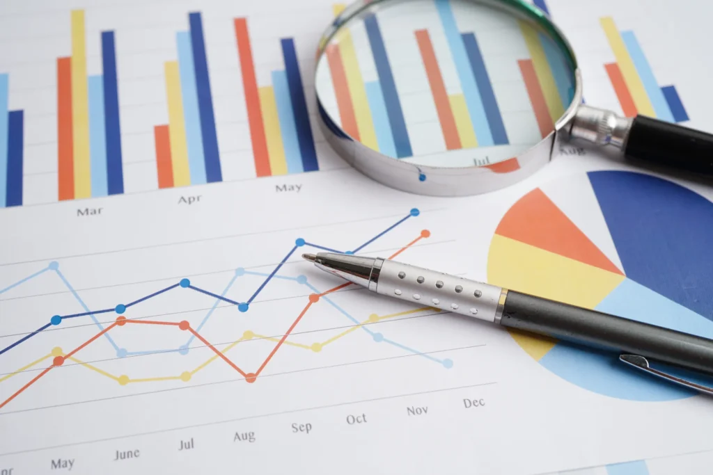
Bar charts are a simple yet powerful method of presentation of the data using rectangular bars to show quantities or frequencies. They make it easy to spot patterns or trends at a glance. Bar charts can be vertical (column charts) or horizontal, depending on how you want to display your data.
In a bar graph, categories are displayed on one axis, usually the x-axis for vertical charts and the y-axis for horizontal ones. The bars’ lengths represent the values or frequencies of these categories, with the scale marked on the opposite axis.
These charts are ideal for comparing data across different categories or showing trends over time. Each bar’s height (or length in a horizontal chart) is directly proportional to the value it represents. This visual representation helps illustrate differences or changes in data.
Bar charts are versatile tools in business reports, academic presentations, and more. To make your bar charts effective:
- Ensure they are concise and have easy-to-read labels.
- Avoid clutter by not including too many categories, making the chart hard to read.
- Keep it simple to maintain clarity and impact, whether your bars go up or sideways.
Line Graphs

Line graphs show how data changes over time or with continuous variables. They connect points of data with straight lines, making it easy to see trends and fluctuations. These graphs are handy when comparing multiple datasets over the same timeline.
Using line graphs, you can track things like stock prices, sales projections, or experimental results. The x-axis represents time or another continuous variable, while the y-axis shows the data values. This setup allows you to understand the ups and downs in the data quickly.
To make your graphs effective, keep them simple. Avoid overcrowding with too many lines, highlight significant changes, use labels, and give your graph a clear, catchy title. This will help your audience grasp the information quickly and easily.
Dashboards

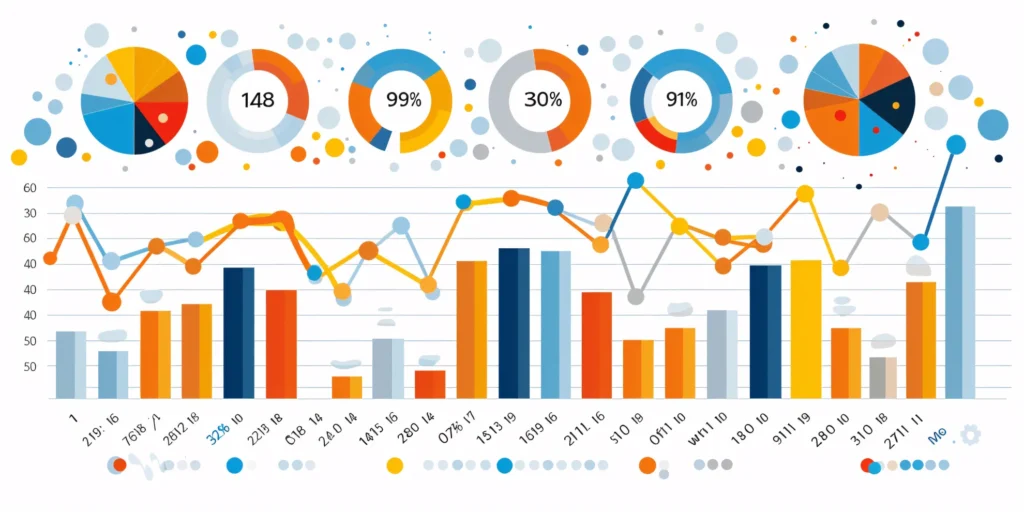
A data dashboard is a data analysis presentation example for analyzing information. It combines different graphs, charts, and tables in one layout to show the information needed to meet one or more objectives. Dashboards help quickly see Key Performance Indicators (KPIs) by displaying visuals you’ve already made in worksheets.
It’s best to keep the number of visuals on a dashboard to three or four. Adding too many can make it hard to see the main points. Dashboards are helpful for business analytics, like analyzing sales, revenue, and marketing metrics. In manufacturing, they help users understand the production scenario and track critical KPIs for each production line.
Dashboards represent vital points of data or metrics in an easy-to-understand way. They are often an interactive presentation idea, allowing users to drill down into the data or view different aspects of it.
Pie Charts

Pie charts are circular graphs divided into parts to show numerical proportions. Each portion represents a part of the whole, making it easy to see each component’s contribution to the total.
The size of each slice is determined by its value relative to the total. A pie chart with more significant points of data will have larger slices, and the whole chart will be more important. However, you can make all pies the same size if proportional representation isn’t necessary.
Pie charts are helpful in business to show percentage distributions, compare category sizes, or present simple data sets where visualizing ratios is essential. They work best with fewer variables.For more variables, it’s better to use a pie chart calculator that helps to create pie charts easily for various data sets with different color slices.
Each “slice” represents a fraction of the total, and the size of each slice shows its share of the whole. Pie charts are excellent for showing how a whole is divided into parts, such as survey results or demographic data.
While pie charts are great for simple distributions, they can get confusing with too many categories or slight differences in proportions. To keep things clear, label each slice with percentages or values and use a legend if there are many categories. If more detail is needed, consider using a donut chart with a blank center for extra information and a less cluttered look.
Histogram

A histogram is a graphical presentation of data to help in understanding the distribution of numerical values. Unlike bar charts that show each response separately, histograms group numeric responses into bins and display the frequency of reactions within each bin. The x-axis denotes the range of values, while the y-axis shows the frequency of those values.
Histograms are useful for understanding your data’s distribution, identifying shared values, and spotting outliers. They highlight the story your data tells, whether it’s exam scores, sales figures, or any other numerical data.
Histograms are great for visualizing the distribution and frequency of a single variable. They divide the data into bins, and the height of each bar indicates how many points of data fall into that bin. This makes it easy to see trends like peaks, gaps, or skewness in your data.
To make your histogram effective, choose bin sizes that capture meaningful patterns. Clear axis labels and titles also help in explaining the data distribution.
Scatter Plot
Using individual data points, a scatter plot chart is a presentation of data in visual form to show the relationship between two variables. Each variable is plotted along the x-axis and y-axis, respectively. Each point on the scatter plot represents a single observation.
Scatter plots help visualize patterns, trends, and correlations between the two variables. They can also help identify outliers and understand the overall distribution of data points. The way the points are spread out or clustered together can indicate whether there is a positive, negative, or no clear relationship between the variables.
Scatter plots can be used in practical applications, such as in business, to show how variables like marketing cost and sales revenue are related. They help understand data correlations, which aids in decision-making.
To make scatter plots more effective, consider adding trendlines or regression analysis to highlight patterns. Labeling key data points or tooltips can provide additional information and make the chart easier to interpret.
Pictogram

A pictogram is the simplest form of data presentation and analysis, often used in schools and universities to help students grasp concepts more effectively through pictures.
This type of diagram uses images to represent data. For example, you could draw five books to show the number of books sold in the first week of release, with each image representing 1,000 books. If consumers bought 5,000 books, you would display five book images.
Using simple icons or images makes the information visually intuitive. Instead of relying on numbers or complex graphs, pictograms use straightforward symbols to depict data points. For example, a thumbs-up emoji can illustrate customer satisfaction levels, with each emoji representing a different level of satisfaction.
Pictograms are excellent for visual data presentation. Choose symbols that are easy to interpret and relevant to the data to ensure clarity. Consistent scaling and a legend explaining the symbols’ meanings are essential for an effective presentation.
Textual Presentation

Textual presentation uses words to describe the relationships between pieces of information. This method helps share details that can’t be shown in a graph or table. For example, researchers often present findings in a study textually to provide extra context or explanation. A textual presentation can make the information more transparent.
This type of presentation is common in research and for introducing new ideas. Unlike charts or graphs, it relies solely on paragraphs and words.
Textual presentation also involves using written content, such as annotations or explanatory text, to explain or complement data. While it doesn’t use visual presentation aids like charts, it is a widely used method for presenting qualitative data. Think of it as the narrative that guides your audience through the data.
Adequate textual data may make complex information more accessible. Breaking down complex details into bullet pointsor short paragraphs helps your audience understand the significance of numbers and visuals. Headings can guide the reader’s attention and tell a coherent story.
Tabular Presentation
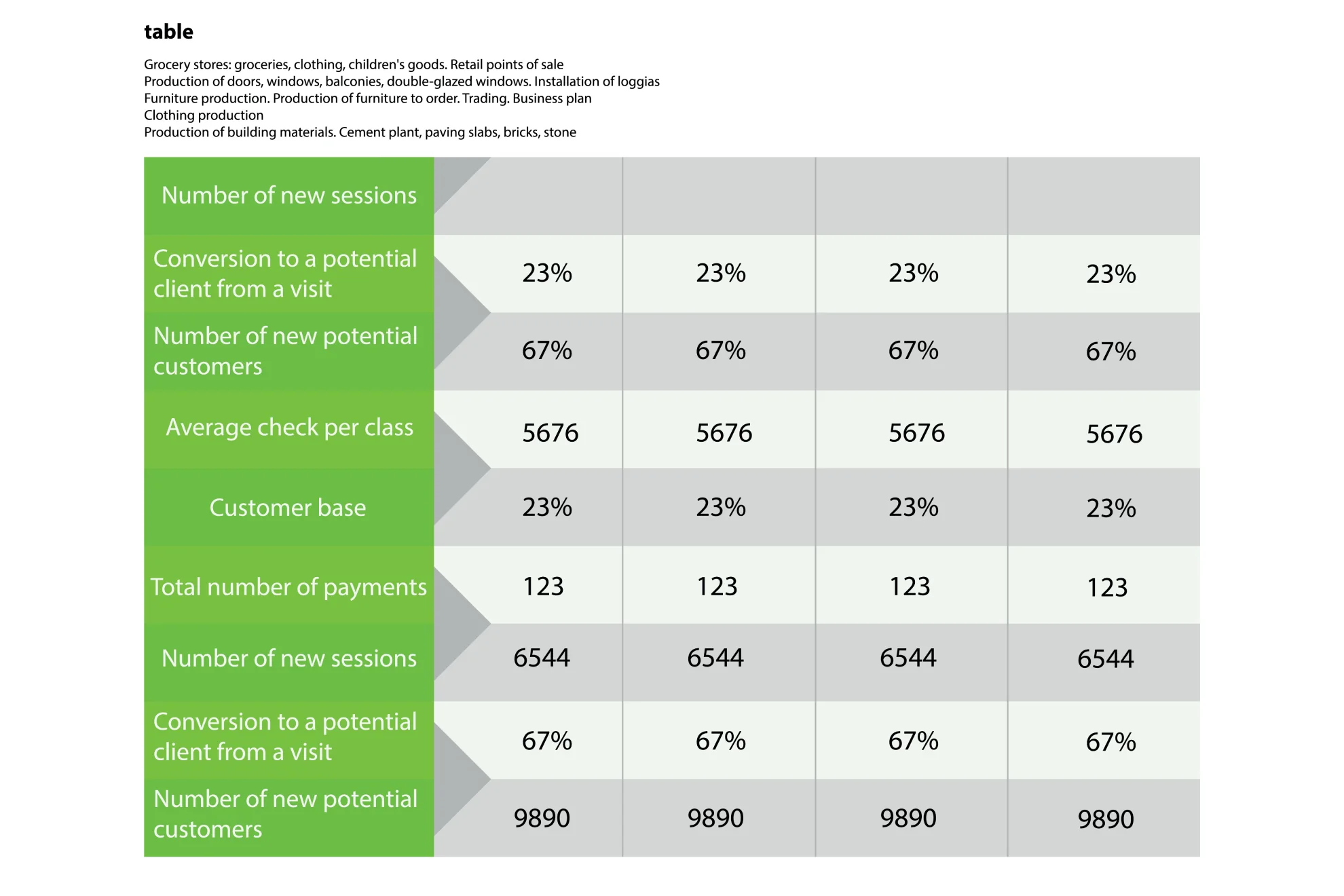
Tabular presentation uses tables to share information by organizing data in rows and columns. This method is useful for comparing data and visualizing information. Researchers often use tables to analyze data in various classifications:
Qualitative classification: This includes qualities like nationality, age, social status, appearance, and personality traits, helping to compare sociological and psychological information.
Quantitative classification: This covers items you can count or number.
Spatial classification: This deals with data based on location, such as information about a city, state, or region.
Temporal classification: This involves time-based data measured in seconds, hours, days, or weeks.
Tables simplify data, making it easily consumable, allow for side-by-side comparisons, and save space in your presentation by condensing information.
Using rows and columns, tabular presentation focuses on clarity and precision. It’s about displaying numerical data in a structured grid, clearly showing individual data points. Tables are invaluable for showcasing detailed data, facilitating comparisons, and presenting exact numerical information. They are commonly used in reports, spreadsheets, and academic papers.
Organize tables neatly with clear headers and appropriate column widths to ensure readability. Highlight important data points or patterns using shading or font formatting. Tables are simple and effective, especially when the audience needs to know precise figures.
Elevate Business Decisions with Effective Data Presentations
Data presentations are essential for transforming complex data into understandable and actionable insights. Data presentations simplify the process of interpreting quantitative information by utilizing data presentation examples like charts, graphs, tables, infographics, dashboards, and clear narratives. This method of storytelling with visuals highlights trends, patterns, and insights, enabling audiences to make informed decisions quickly.
In business, data analysis presentations are invaluable. Different types of presentation tools like bar charts help compare categories and track changes over time, while dashboards consolidate various metrics into a comprehensive view. Pie charts and histograms offer clear views of distributions and proportions, aiding in grasping the bigger picture. Scatter plots reveal relationships between variables, and pictograms make data visually intuitive. Textual presentations and tables provide detailed context and precise figures, which are essential for thorough analysis and comparison.
Consider the audience’s knowledge level to tailor the best way to present data in PowerPoint. Clear context, simple visuals, and thoughtful organization ensure the data’s story is easily understood and impactful. Mastering these nine data presentation types can significantly enhance business success by making data-driven decisions more accessible and practical.
Frequently Asked Questions (FAQs)
1. What is a data presentation?
A data presentation is a slide deck that uses visuals and narrative techniques to make complex data easy to understand and actionable. It includes charts, graphs, tables, infographics, dashboards, and clear text explanations.
2. Why are data presentations important in business?
Data presentations are crucial because they help highlight trends, patterns, and insights, making it easier for the audience to understand complicated concepts. This enables better decision-making and deeper analysis.
3. What types of data presentation tools are commonly used?
Common tools include bar charts, line graphs, dashboards, pie charts, histograms, scatter plots, pictograms, textual presentations, and tables. Each tool has a unique way of representing data to aid understanding.
4. How can I ensure my data presentation is effective?
To ensure effectiveness, provide context, compare data sets using visual aids, consider your audience’s knowledge level, and keep visuals simple. Organizing information thoughtfully and avoiding clutter enhances clarity and impact.
Transform Your Data into Compelling Stories with Prezentium
Unlock the full potential of your business data with Prezentium‘s expert presentation services. Our AI-powered solutions turn complex data into clear, actionable insights, helping you easily make informed decisions.
Prezentium’s Overnight Presentations ensure you wake up to a stunning, ready-to-use presentation in your inbox by 9:30 am PST. Send your requirements by 5:30 pm PST, and let our team combine business acumen, visual design, and data science to craft a presentation that highlights trends and insights seamlessly.
Our Presentation Specialists transform raw ideas and meeting notes into captivating presentations. Whether you need new designs or bespoke templates, our experts bring your vision to life with precision and creativity.
Enhance your team’s skills with Zenith Learning, our interactive workshops that blend structured problem-solving with visual storytelling. Learn to present data effectively and make a lasting impact in your business communications.
Prezentium’s services are designed to help you make the most of your data, from bar charts to dashboards, ensuring your presentations are informative and visually engaging. Let us help you tell your data’s story in a way that resonates. Contact Prezentium today to elevate your business presentations.

