“Styles come and go. Good design is a language, not a style.” – Massimo Vignelli
The principle of alignment in design refers to the arrangement of visual elements in a structured and organized way. It ensures that text, images, and other design components are positioned in relation to each other or to a common baseline, creating a sense of order and harmony.
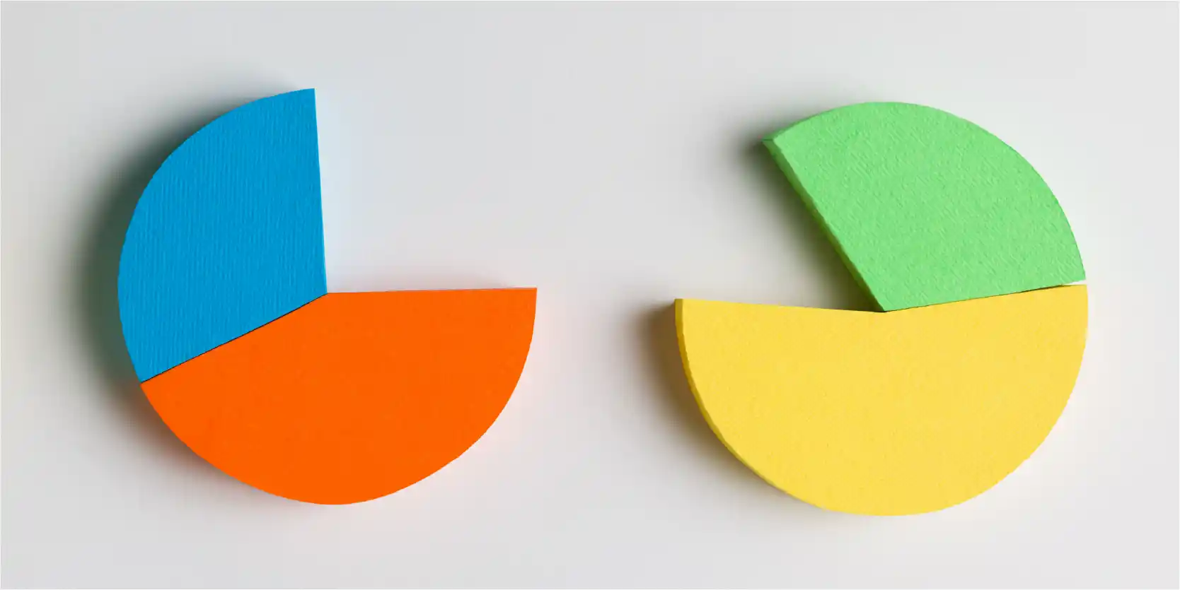
Alignment plays a key role in making a design look sharp, clear, and visually appealing. It helps guide the viewer’s focus through the content, making it easier to read and understand. When elements are properly aligned, they establish relationships with each other, reinforcing a cohesive design. If elements are misaligned, the result can feel chaotic and disorganized—like books scattered on a shelf instead of neatly stacked.
In design, alignment is both a principle and a practical technique. Designers use it to create balance, structure, and connections between elements. Whether aligning text to the left, right, or center, or arranging objects in relation to a grid, alignment brings clarity and professionalism to a layout. If a design feels “off,” checking the alignment is often a good first step in refining it.
Key Takeaways
Alignment Creates Order and Readability: Proper alignment ensures that text, images, and design elements are structured in an organized way. This improves readability, creates visual harmony, and makes content easier to understand.
Enhances User Experience and Navigation: Consistent alignment helps users quickly scan and navigate content, especially in digital interfaces. It provides a predictable design, reducing confusion and making interactions smoother.
Supports Branding and Professionalism: Alignment strengthens a brand’s visual identity by creating a polished, cohesive look across websites, marketing materials, and logos. It conveys professionalism and aesthetic balance.
Improves Accessibility and Responsiveness: Well-aligned elements make digital content more accessible to all users, including those with special needs. Alignment also helps designs adapt smoothly to different screen sizes for a seamless mobile experience.
Alignment Principle of Design: Importance
Enhancing Visual Appeal and Readability
Alignment is essential in design because it creates a visually appealing and well-organized layout. Proper alignment improves readability and makes content easier to scan, ensuring that users can quickly grasp key information. When elements are aligned, they establish a clear hierarchy, guide the viewer’s attention, and contribute to a polished, professional look. Without alignment, a design can feel cluttered and disorganized, making it difficult for users to extract meaningful takeaways.
Creating Structure and Logical Flow
Alignment helps build a solid structure by connecting elements in a meaningful way. The human brain naturally assumes that aligned elements, whether horizontally or vertically, are related. This subtle visual cue makes content easier to follow and understand. Misaligned elements, on the other hand, can confuse users and lead to misinterpretation. By following the principles of alignment, designers ensure that information is presented logically, reducing cognitive load and enhancing comprehension.
Improving User Experience and Navigation
In digital interfaces, alignment plays a key role in user experience. When elements are consistently aligned across screens or pages, users can quickly understand the design and navigate more efficiently. This consistency fosters familiarity and predictability, making interactions smoother and more intuitive. Proper alignment also reduces distractions and allows users to focus on completing their tasks without unnecessary confusion.
Strengthening Brand Identity and Aesthetic Appeal
Alignment is a crucial aspect of branding and visual identity. Major brands leverage alignment to create a unified and recognizable look in their logos, websites, and marketing materials. By aligning elements such as text, images, and navigation menus, designers reinforce a company’s brand presence and maintain visual harmony. Whether it’s following a grid system or using specific spacing guidelines, alignment helps convey professionalism and aesthetic balance.
Enhancing Accessibility and Responsiveness
Alignment is a key factor in making online content accessible to all users, including those with special needs. Consistently aligned elements provide clear visual cues, making it easier for users to navigate with assistive technologies such as screen readers. Proper alignment also ensures that interactive elements remain within the viewport, preventing important information from being hidden or cut off. In responsive design, alignment allows content to adapt fluidly across different screen sizes, ensuring readability and usability on desktops, tablets, and mobile devices.
Supporting Responsive and Mobile-Friendly Design
In today’s digital landscape, alignment is vital for responsive design. As websites and applications adjust to various screen sizes, strategically aligned elements help maintain a consistent and visually appealing design. For instance, vertical alignment of navigation menus on mobile devices enhances usability by allowing for easy scrolling and touch interaction. Well-aligned content ensures that users can quickly find information, improving their overall experience on mobile platforms.
Alignment is a basic principle of design that enhances visual appeal, improves readability, and strengthens user experience. It provides structure, supports branding consistency, and contributes to accessibility and responsiveness. By applying alignment effectively, designers can create layouts that are not only aesthetically pleasing but also functional and user-friendly. Whether in digital interfaces, branding materials, or mobile experiences, alignment remains a crucial factor in delivering clear and impactful designs.
Alignment Principle of Design: Examples
Left Alignment: Clean and Readable
Left alignment is one of the most commonly used alignment techniques in design. It aligns text and elements along the left edge, creating a clean and structured look. Because most people read from left to right, this alignment feels natural and unobtrusive. It is widely used for descriptive text, paragraphs, and outlining points, as it maintains readability while ensuring a professional appearance.
Center Alignment: Drawing Attention
Center alignment is a powerful way to make elements stand out without using bold colors or other attention-grabbing techniques. When elements are centered, they appear dominant and become focal points within the design. This type of alignment is commonly used for titles, logos, and key graphics. However, overusing center alignment can reduce its impact, making the design appear less dynamic.
Right Alignment: Complementary and Directional
Right alignment positions elements along the right edge of a design. This alignment is often used for secondary content, such as metadata or supporting details, as it gives the impression of an add-on to the main content. In certain contexts, such as languages that read from right to left, alignment to the right helps guide the viewer’s eye naturally. It can also be used intentionally to create a sense of movement from right to left.
Justified Alignment: Structured and Balanced
Justified alignment ensures that text or elements are evenly distributed from edge to edge, creating a structured and balanced look. This technique is often seen in newspapers and formal documents, where it helps maintain a consistent design. However, justified alignment can sometimes cause uneven spacing between words, which may affect readability. It is best used for descriptive passages and when working with larger blocks of text.
Vertical Alignment: Guiding the Eye
Vertical alignment determines the positioning of elements along the vertical axis, enhancing structure and readability. Items can be aligned to the top, middle, or bottom of a design.
- Top alignment establishes a unified starting point, guiding the reader’s eye downward.
- Middle alignment is ideal when elements do not fill the entire space, creating a balanced and centered look.
- Bottom alignment is less common but can be useful for aligning elements that flow together in a structured way.
Edge Alignment: Creating Consistency
Edge alignment involves positioning elements along a common horizontal or vertical edge. This technique is crucial in design as it enhances consistency and improves the overall aesthetics of a design. It is often used in web design to align body text, menu items, and other structured elements, ensuring a polished and organized appearance.
The principle of alignment is essential in design, helping create order, readability, and emphasis. Whether using left, right, center, justified, or edge alignment, designers can guide the viewer’s eye, highlight key elements, and maintain consistency in their layouts. Choosing alignment in design examples depends on the content’s purpose and the desired visual effect.
Alignment Principle of Design: Best Practices
Maintain Consistency Across Your Design
Consistency is key when applying design alignment. Keeping a uniform alignment strategy across all pages or screens creates a sense of familiarity and predictability for users. For example, aligning all headings, body text, and images to the left throughout an entire website or app ensures a cohesive and professional appearance.
Use Alignment to Reinforce Hierarchy
Alignment plays a significant role in establishing hierarchy and relationships between elements. Left-aligned headings and body text create a structured and readable design, while center-aligning call-to-action buttons can draw attention and encourage user interaction. This method ensures that users can quickly identify the most critical elements on a page.
Utilize Grid Systems for Structure
Grid systems help maintain alignment and spacing throughout a design, resulting in a well-organized and visually appealing layout. A modular grid, for example, ensures that images, text, and user interface components are placed in a structured manner. This approach keeps designs neat, balanced, and easy to navigate.
Consider Other Design Principles
While alignment is essential, it should not overshadow other crucial design principles like white space, contrast, and proximity. Adequate white space between aligned elements prevents clutter, while contrast helps differentiate primary and secondary content. Balancing these elements enhances the overall readability and usability of a design.
Ensure Responsiveness Across Devices
Alignment should be flexible enough to adapt to different screen sizes and devices. On mobile devices, elements should be stacked vertically and centrally aligned for a clear and uncluttered appearance. For larger screens, left alignment often provides better readability and flow. A responsive approach ensures a consistent and user-friendly experience across platforms.
Highlight Hierarchy While Maintaining Balance
Not all design elements hold the same level of importance, so alignment should reflect their hierarchy. Designers often use different types of alignment to emphasize key components of a composition. However, it is also important to maintain harmony among all elements. A well-balanced design ensures a visually pleasing experience for users.
Use Contrast to Enhance Clarity
Contrast can help balance harmony in design. When multiple elements need attention, leveraging alignment contrast—such as combining left and right text alignment—can effectively direct user focus. Additionally, color contrast can highlight key sections and improve readability.
Leverage Repetition for Neatness
Repetition plays a vital role in alignment by creating a tidy and structured design. Applying the same alignment style consistently across different sections makes the design more cohesive. Repeating alignment patterns also helps users quickly understand the design’s structure, improving navigation and usability.
Keep It Simple and Uncluttered
Simplicity is a fundamental principle in alignment. No matter which alignment method you use, the final design should not feel overcrowded. Leaving enough space between elements allows for a clean, professional look and provides users with an effortless browsing experience. Less clutter means more focus on key content and a more visually appealing design.
Wrap-up: Alignment in Graphic Design Principle
Alignment is a fundamental design principle that brings order and structure to layouts. It ensures that visual elements—such as text, images, and graphics—are arranged in a way that enhances readability, clarity, and visual appeal. Proper alignment helps guide the viewer’s eye, establish relationships between elements, and create a sense of professionalism. Whether left, right, center, or justified, each alignment style serves a unique purpose in design.
Beyond aesthetics, alignment plays a key role in user experience. It improves navigation, strengthens branding, and ensures consistency across different screens and devices. By maintaining alignment, designers can create balanced and functional designs that are both engaging and accessible. It also works hand in hand with other design principles, such as contrast and white space, to deliver a seamless visual experience.
When used effectively, alignment transforms a design from scattered and chaotic to polished and purposeful. It is a simple yet powerful tool that helps designers create visually cohesive and user-friendly compositions.
Frequently Asked Questions (FAQs)
1. What is the principle of alignment in design?
Alignment is the arrangement of visual elements in a structured way to create order, clarity, and balance. It ensures that text, images, and other design components are positioned relative to each other or a common baseline.
2. Why is alignment important in graphic design?
Proper alignment improves readability, enhances visual appeal, and guides the viewer’s eye through content. It also helps create a structure, making designs look polished and professional.
3. How does alignment improve user experience?
Consistent alignment across digital interfaces makes navigation smoother and more intuitive. It reduces distractions, improves accessibility, and ensures that users can easily find and understand key information.
4. What are common types of alignment?
Designers use left, center, right, justified, and vertical alignment techniques. Each type serves a different purpose, such as improving readability, emphasizing key elements, or maintaining consistency in a design.
Align Your Message with Winning Design
A well-aligned presentation is not just visually appealing—it’s effective. At Prezentium, we use the principle of alignment to structure your content for clarity, readability, and impact. Whether it’s overnight presentations, Accelerator transformations, or Zenith Learning workshops, our experts ensure that every slide is polished and professional. Proper alignment enhances your message, guides your audience’s attention, and reinforces a cohesive story. Don’t let misaligned slides dilute your ideas. Let Prezentium turn your notes, data, and concepts into a seamless, visually compelling presentation. Get started today and experience the power of aligned storytelling.